Real Faces vs Polished YouTube Thumbnails: Why the Prettier One Lost
For B2B and industrial YouTube channels, a real frame with a real face (or the real product) and three words or fewer often beats a polished agency or AI-designed thumbnail, because expert buyers tend to read heavy polish as an ad. Don't settle it in a meeting. Run YouTube's Test & Compare on one video, and let it pick the winner on watch time, not clicks.
The thumbnail everyone agreed on
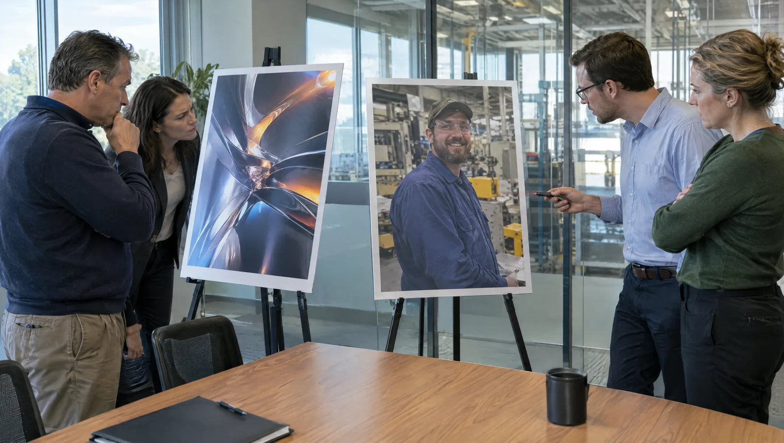
The thumbnail everyone in the room agreed was better got a 0% click-through rate overnight.
You've been in that room. Third round of brand review. The agency version is gorgeous: the plant at golden hour, a gradient sweep, the logo top right and a nine-word headline nobody can read on a phone. Next to it sits the rough option, a real frame from the shoot. Your line supervisor, mid-sentence, squinting a little.
Nobody picks the squint. Everyone picks the sunset.
That 0% is a real report. One creator said he swapped a live video's thumbnail for a polished, AI-designed one, and click-through sat at 0% all night. His rough handmade thumbnails, built around his own face, had been running anywhere from 3% to 16%.
One overnight reading on one channel is a tiny sample, and we'd never call it proof. But it fits a pattern we kept running into. We read thousands of threads where marketers trade notes on what they've actually tested, and "the prettier thumbnail lost" shows up far more often than you'd guess.
So what? The thumbnail that wins the meeting isn't always the one that wins the feed. Your job isn't to pick. It's to test.
Why polish can backfire with expert viewers
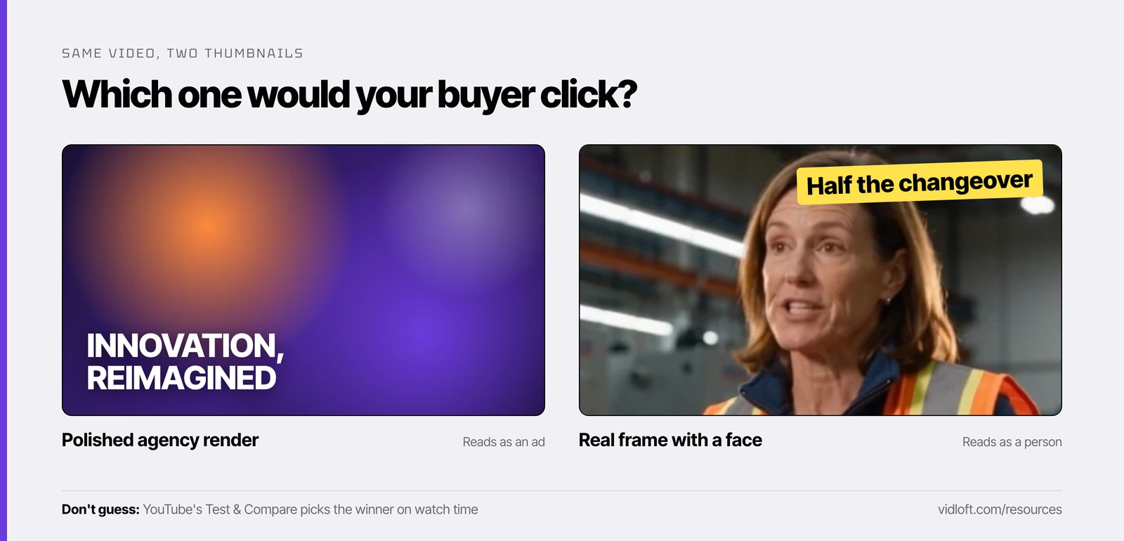
People who have seen a thousand ads read heavy polish as one more ad. A slightly imperfect human frame reads as a real person with something real to say.
Practitioners who have dug into this explain it two ways:
- Polish reads as advertising. Glossy gradients, perfect lighting and big headline text are what ads look like, and experienced viewers have trained their thumbs to scroll past ads.
- Polish reads as generic. A rendered factory could be anyone's factory. Your actual plant, with an actual person in your actual safety vest, can only be yours.
The effect seems strongest with expert audiences, people who know a subject well enough to spot filler from a thumbnail. Engineers. Plant managers. The procurement lead who has sat through 40 vendor decks this quarter.
That's your B2B buyer. They're experts in their own jobs, and they've seen every shiny render a trade show can offer.
One practitioner went a step further. He reported that his own handmade thumbnails beat YouTube's AI-generated suggestions in his A/B tests. Again, one person, one channel.
YouTube's own advice leans the same way, minus the drama. Its thumbnail and title tips suggest showing viewers who already know you something familiar, using a font that's easy to read, and keeping the design from getting too complex. Nowhere does it say "make it shinier."
The honest part: polish sometimes wins
The evidence is mixed, which is exactly why you should test instead of argue.
Not everyone sees a penalty. Some creators report swapping in AI-designed thumbnails with no drop at all. At least one practitioner thinks AI thumbnails currently earn higher click-through than handmade ones, possibly because they're bolder and brighter than what most people make on their own.
So we're not saying "fire the agency." We're saying the agency version isn't automatically safer just because it looks more expensive. AI earns its keep in plenty of video work. A thumbnail aimed at an expert buyer is a place to test it before you trust it.
Keep one number in mind. YouTube says half of all channels and videos have an impressions click-through rate between 2% and 10%, and that new videos or ones with fewer than 100 views can swing even wider. A result built on 40 impressions tells you about as much as a coin flip.
The thumbnail test plan for a corporate channel
Match the style to the video, build two real options, and let YouTube's own test pick on watch time.
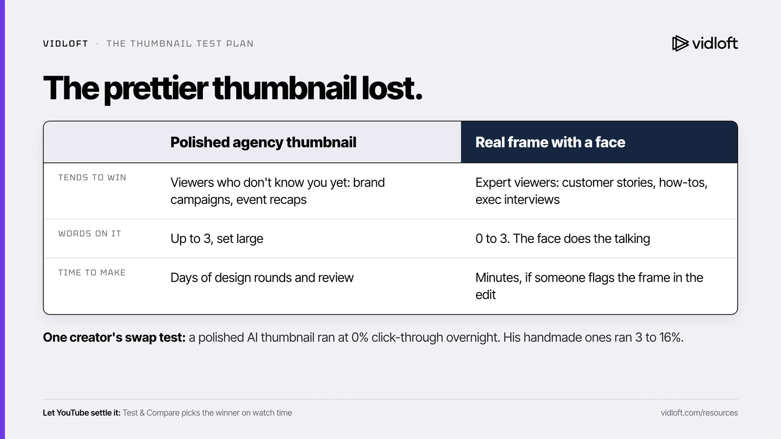
Polished agency thumbnail vs real frame with a face
| Polished agency thumbnail | Real frame with a face | |
|---|---|---|
| What it is | A designed composite: brand colors, graphics, often rendered or AI-assisted | A frame pulled from your actual footage: a real person or the real product |
| Tends to win when | Viewers don't know the subject yet: broad brand campaigns, launch reels, event recaps | Viewers are experts: customer stories, how-to and process videos, exec interviews, skilled-trade recruiting |
| Tends to lose when | It looks like the last 1,000 ads, or it could be any company's video | The frame is dark, blurry or caught mid-blink |
| What to put in it | One hero shot of the product, brand color behind it, one bold line | One face with a real reaction, or hands on the real equipment, plus the thing they're looking at |
| Words of text | Up to 3, set large. It's already competing with its own graphics | 0 to 3. The face is doing the talking |
| Logo | Small, one corner | Small or none. The video carries the brand |
| Time to make | Days of design rounds and brand review | Minutes, if someone flags the frame during the edit |
Run Test & Compare on one existing video this week
YouTube's built-in Test & Compare is the cleanest way to settle the debate. YouTube's own analytics help warns that testing several thumbnails by hand on the same video is unreliable, because each version may reach a different audience. Test & Compare splits the traffic for you and holds back a small control group.
- Pick the video. A public, long-form video that still gets steady impressions. Not a Short, not made for kids, not private. A Premiere only qualifies after it ends and becomes a regular video.
- Check eligibility. Your channel needs advanced features turned on, and you need YouTube Studio on a computer. It isn't in the phone app.
- Build two or three options. Option A is the current polished thumbnail. Option B is a real frame with a face and three words or fewer. Option C, if you want one, is the real product in someone's hands. Export at 1280x720 or larger, since smaller images get downscaled for the test.
- Put your safe pick first. If the result is inconclusive, YouTube keeps showing the first thumbnail you uploaded. Make it one brand can live with.
- Start it and leave it alone. Changing the title or thumbnail mid-test stops it, and you start over. Tests should finish within two weeks, sometimes in a few days, depending on impressions.
- Read the result.
- Winner: one option earned a clearly higher share of watch time, and YouTube now shows it to everyone. People clicked and stayed.
- Performed Same: no real difference. Pick the one you like. "Cheaper to make next time" is a perfectly good tiebreaker.
- Inconclusive: not enough signal. Rerun it on a video with more impressions, or make the options more different from each other.
- Write it down. One line in a shared doc: video, options, result. After three or four tests you have a house style built on data instead of taste.
YouTube optimizes the test for watch time because it wants thumbnails to set accurate expectations. A thumbnail that grabs the click and then disappoints doesn't win. For a second read, check Analytics. YouTube says high click-through paired with low average view duration is a sign of clickbait.
If you're launching a brand-new video rather than testing an old one, get a backup thumbnail approved before you publish. That's the hour-two swap rule. And once the thumbnail earns the click, the first spoken sentence has to keep it.
The 6-point thumbnail checklist for industrial and B2B videos
- A real face or the real product. Your people, your plant, your equipment. No stock photos, no rendered factories.
- Three words maximum. Zero is fine. If it needs a sentence, that's the title's job.
- Readable on a phone. Look at it at feed size on your own phone before you approve it. If you have to squint, so will your buyer.
- One subject, one idea. One face or one machine. YouTube's own tips warn against overly complex designs.
- True to the video. Whoever or whatever is in the thumbnail shows up in the video, ideally early. YouTube's spam policy bans maliciously misleading thumbnails, and on a corporate channel even mild bait spends trust you'll need on the sales call.
- Planned on set. Ask the crew for two or three clean thumbnail frames: good light, eyes open, subject toward camera, room for three words. Ten minutes on shoot day saves a week of design rounds.
The Vidloft take
Most corporate thumbnails are designed to survive brand review, not to get picked by a tired engineer scrolling at 10 p.m. Those are different jobs.
The squinting line supervisor might be your best-performing asset, and you'd never know, because nobody ever tested her against the sunset.
Your buyers are experts. Experts trust what looks real.
Run one test this week. Let the watch time decide. Then bring the result to the next brand review.
Frequently asked questions
Do faces in YouTube thumbnails get more clicks for B2B videos?
Often, according to practitioner reports, especially with expert audiences who tend to read heavy polish as an ad. Results vary by channel, so confirm it on your own videos with YouTube's Test & Compare.
Are AI-generated YouTube thumbnails bad for click-through rate?
Not always. Some creators report sharp drops, others report no penalty or even gains, so treat an AI-designed thumbnail as one option in a test and make sure it accurately shows what's in the video.
How does YouTube Test & Compare pick a winning thumbnail?
It picks the option that earns the highest share of watch time, not the most clicks, and then shows that option to everyone. If the result is inconclusive, YouTube keeps the first thumbnail you uploaded.
How much text should a corporate YouTube thumbnail have?
Three words or fewer works best for most B2B and industrial videos, and zero is fine when a face carries the message. YouTube's own tips say to use an easy-to-read font and keep the design simple.
What is a good click-through rate for a YouTube thumbnail?
YouTube says half of all channels and videos have an impressions click-through rate between 2% and 10%. New videos and videos with fewer than 100 views can swing well outside that range.
Stop Editing.
Start Scaling.
Your content backlog is a goldmine.
Let us help you mine it.